You are not logged in.
- Index
- » Site Announcements
- » New Feature - Dark Mode in Chat!
- » Post a reply
Post a reply
Topic review (newest first)
- Delle78
- 01-26-2022 11:34 am
I think it would be easier to see if the chat text was the same font color as the time stamp instead of dark.
- jhobs1
- 01-18-2022 4:58 pm
I really like the dark mode, thank you for that change, would you also be able to tone down the white on the log in screen as well as the games screen, bright white is hard on the eyes, well my eyes anyways lol
- Allan
- 01-18-2022 10:33 am
Hello, Cases,
The minute I saw the message on dark chatbox, I tried it, and WON'T go back.
- SexySouthernGirl
- 01-18-2022 6:06 am
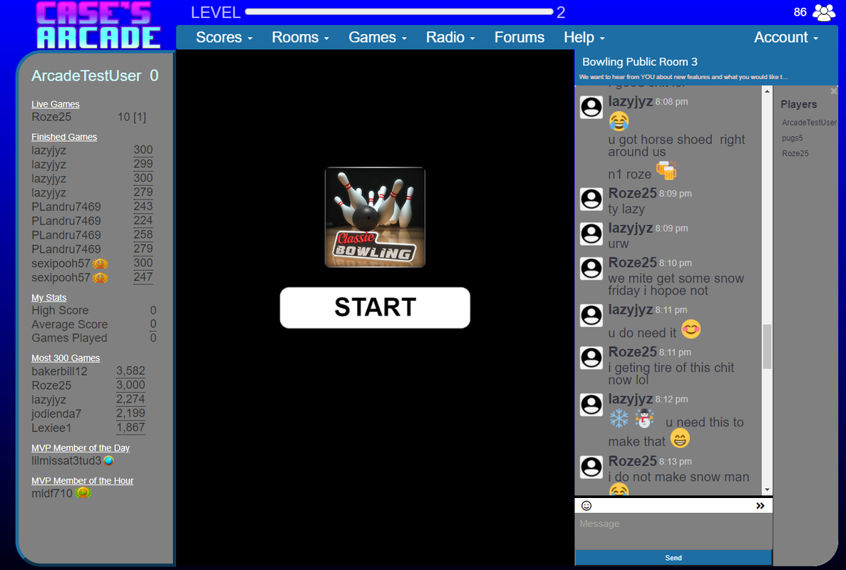
It's not exactly what I had in mind when I suggested it but it's a LOT better than the black/white as before. But when you put your mouse cursor over the text box it disappears. I mentioned this to Laura yesterday when she visited our room and she said she would mention it to the programmers. I think the text box is set to be "always on top" of anything else so that the mouse cursor is hidden underneath it. Thanks for the upgrade!
- Catz11
- 01-17-2022 3:26 pm
much better on the eyes in chat
- Case
- 01-17-2022 2:30 pm
Hi all,
As part of our suggestions thread for bowling we had some users ask about the ability to change the chat to be on a darker background. We thought that was a good idea so now you can turn it on in your Site Settings section under Account in the upper right. We are still fine tuning this so please let us know what you think and thanks to those who suggested it.

Thanks,
Case